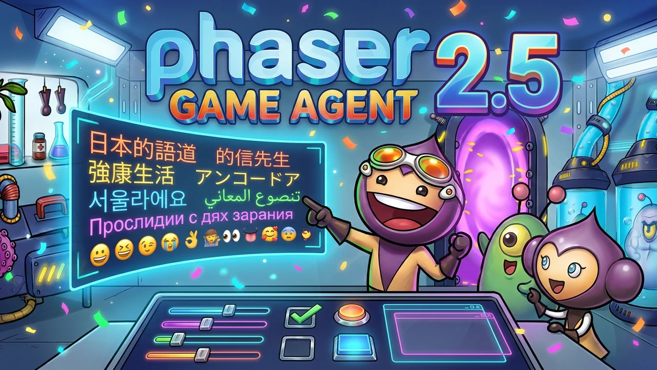
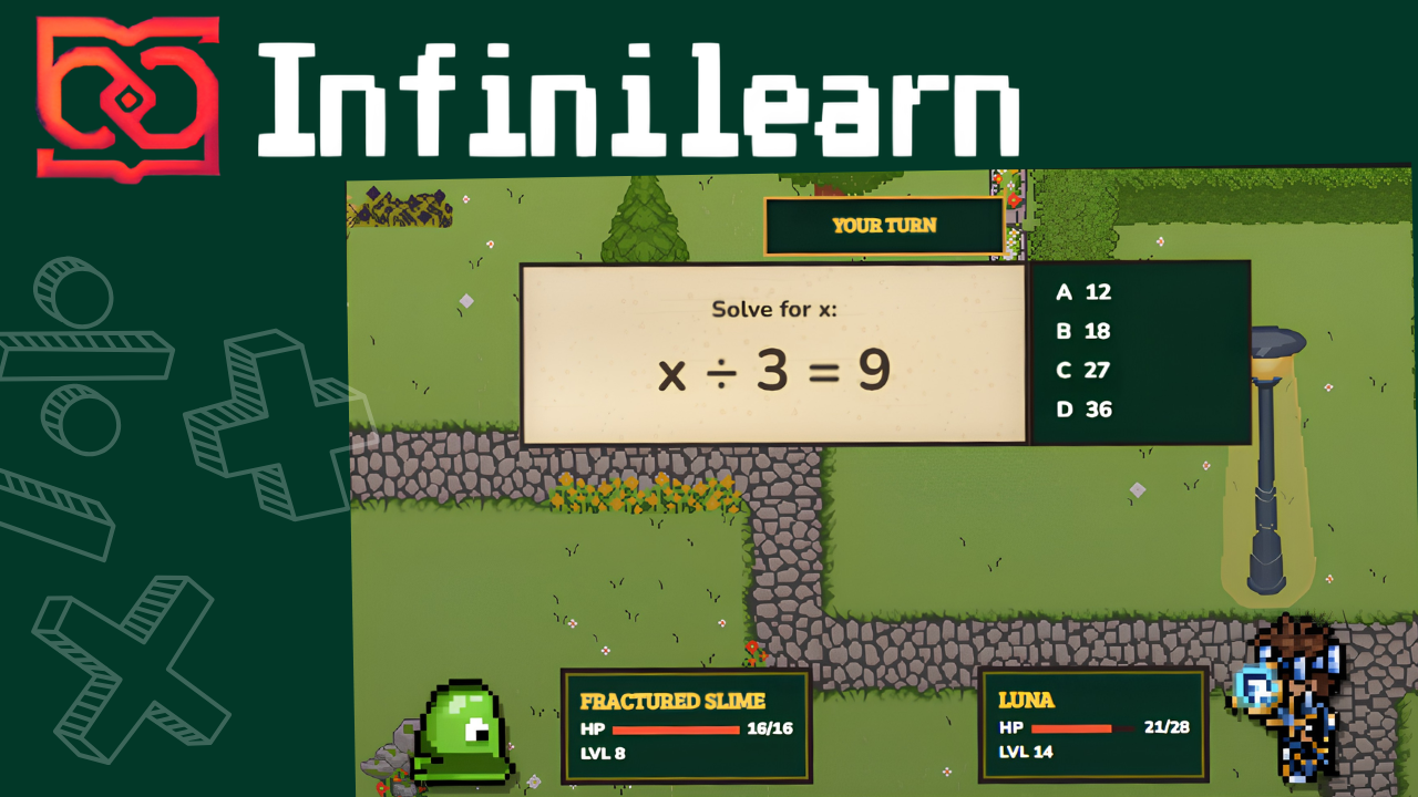
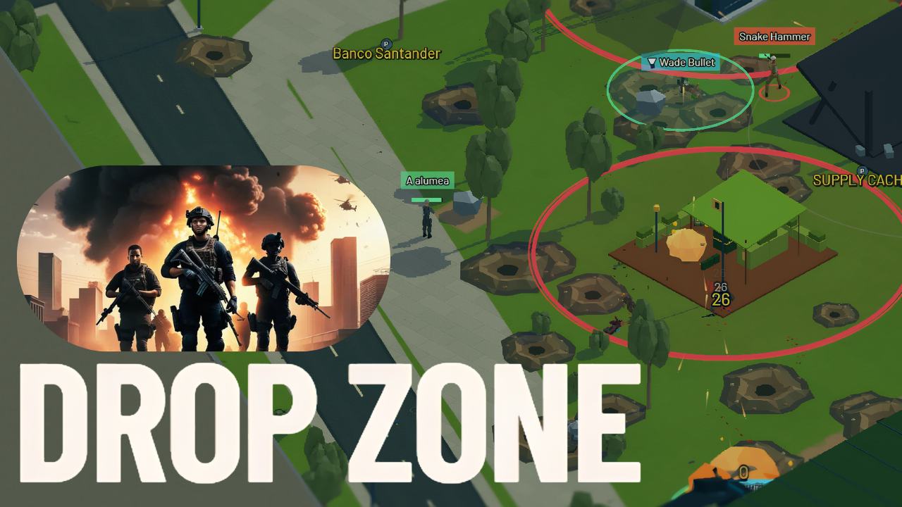
Phaser AE v2.5 is out now, and it's already live in the Phaser Game Agent. Every new game created from this point on is built on it automatically, with nothing to install, enable or upgrade. Games you've already made keep the version they were built with.
It brings two things. The first is text in any language. Every writing system the browser can render now works inside a game, including Japanese, Chinese, Korean, Arabic, Hebrew, Thai, Hindi, Greek, Cyrillic and colour emoji, with right-to-left lines and vertically stacked columns set the way each language expects.
The second is a complete UI system. Settings screens, buttons, dropdowns, sliders, scrolling lists and inventory panels are drawn from GPU geometry rather than textures, so a whole interface needs no artwork at all.
Every writing system, out of the box
Ask almost any web game engine to draw 你好世界 and you get four empty boxes. Ask it for مرحبا and you get something worse: the right letters, in the wrong order, none of them joined up. It looks like text. It is not text. It's the kind of bug that ships, because the person who built the game doesn't read Arabic and neither does anyone who reviewed it.
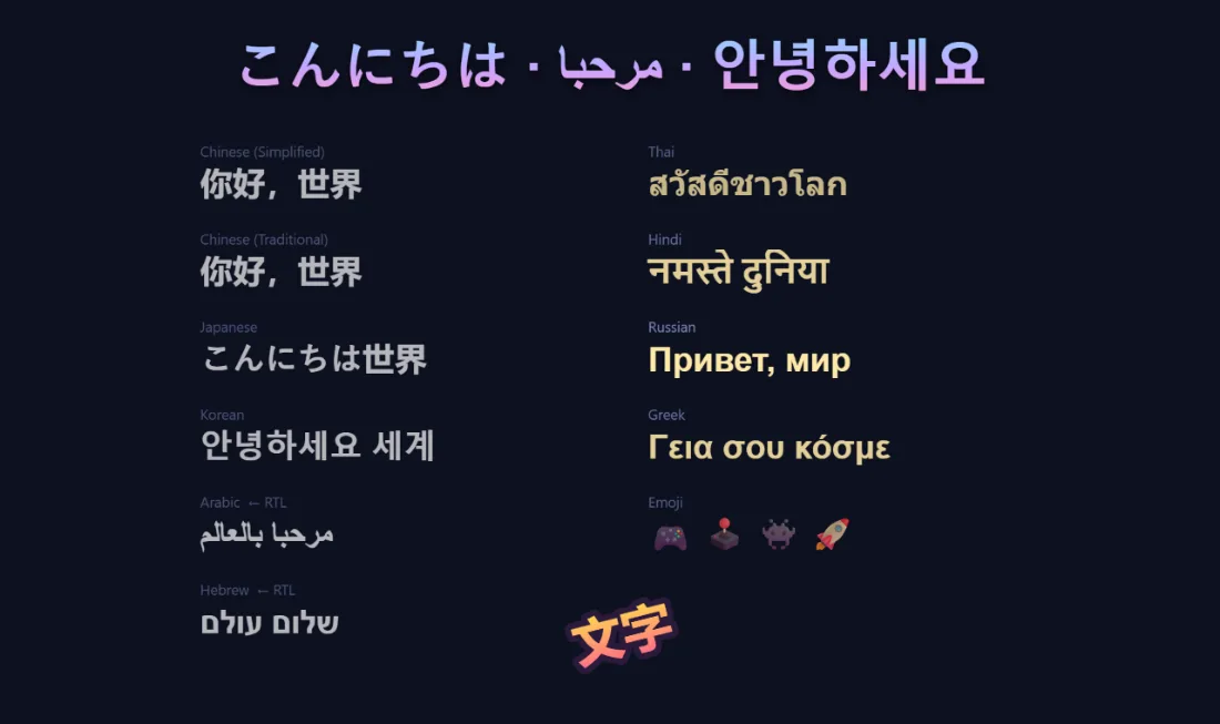
Chinese, Japanese, Korean, Arabic, Hebrew, Thai, Hindi, Greek, Cyrillic and colour emoji all render properly in v2.5, with nothing to configure and no font files to find. The engine hands the hard parts to the browser, which already solves them because it has to render the web, then draws the finished result as a single image on the GPU. A paragraph of Japanese costs a game about as much as one sprite.
Right to left, without asking
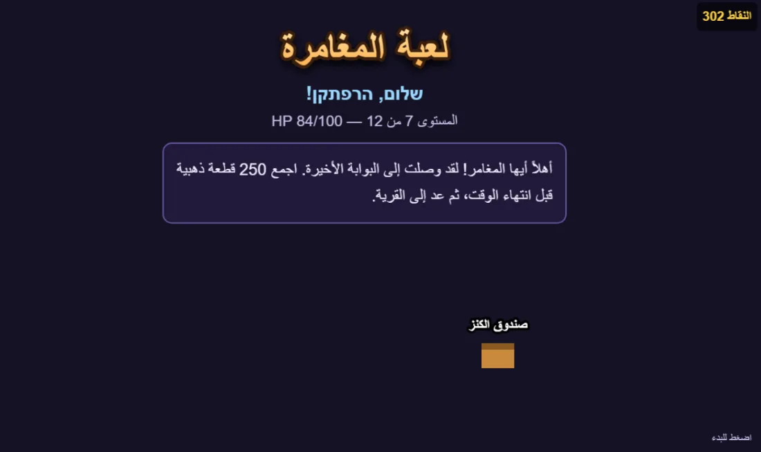
Arabic and Hebrew read right to left, and mix with numbers that read the other way. Every string in that shot was passed straight through. The letters join up, the lines run right to left, the wrapping breaks at real Arabic word boundaries, and the Latin digits inside an Arabic sentence keep their own direction. If المستوى 7 looks wrong to you, it isn't. That's what a bilingual line is supposed to do.
Line breaks that follow the language
Latin wraps at spaces. Japanese has no spaces and breaks almost anywhere, except where its typographic rules forbid it: a full stop may never open a line, an opening bracket may never close one. Thai has no spaces either, and no per-character breaking, so finding a break means knowing the words.
The engine handles all three. A wrapped Thai paragraph breaks at real words. A wrapped Japanese one never orphans a full stop onto the next line. This is the sort of detail nobody notices when it's right and every native reader notices instantly when it's wrong.
Vertical Japanese
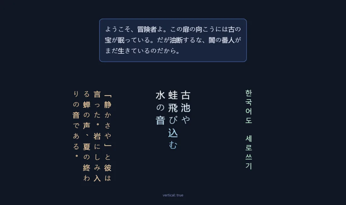
Columns running top to bottom, stacking right to left, with the punctuation rotated and positioned the way traditional setting requires. Useful for a title screen, a scroll, a piece of in-world signage.
It still has to look like a game
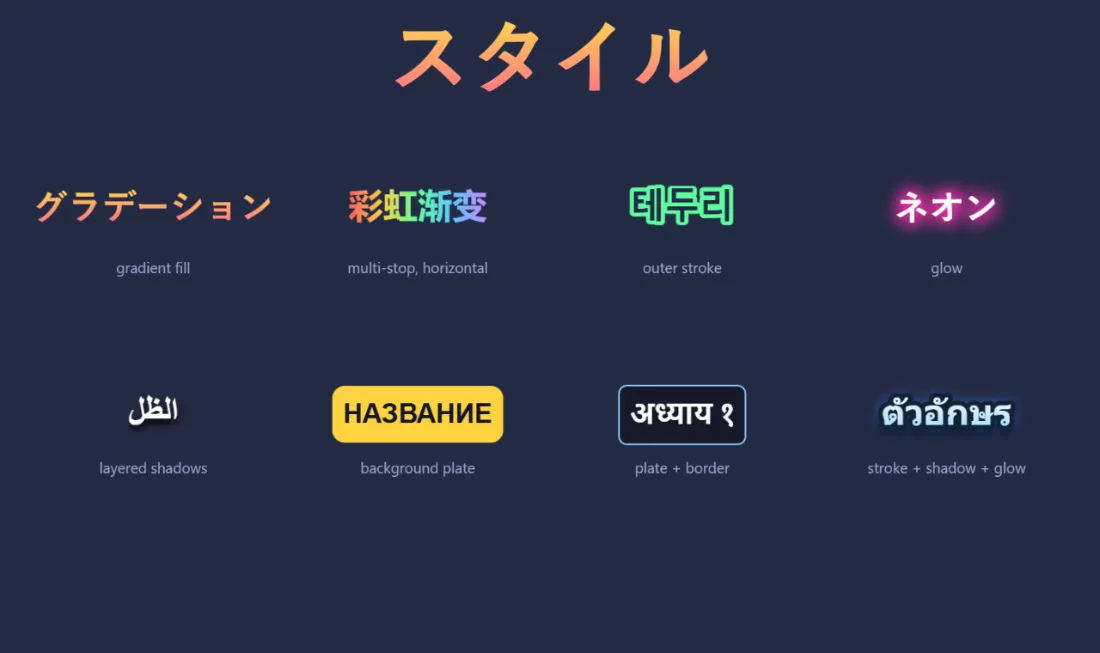
Gradients, outlines, glows, layered drop shadows, underlines and highlight plates all work on every script, and cost nothing per frame. Outlines sit outside the letterform by default, which matters far more on a dense kanji than on Latin, where a centred outline fills in the gaps and turns the character into a blob.
The agent can check its own layout
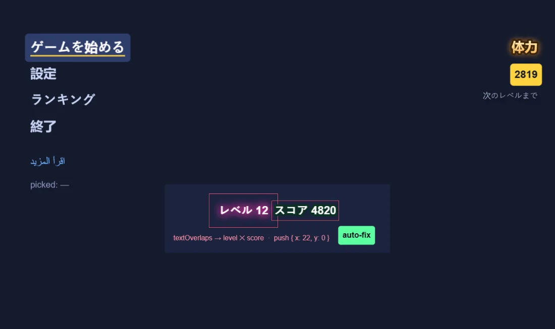
Translated text changes length. A HUD laid out in English will collide in German, and an agent that can't measure its own screen won't know.
Every piece of text can now report the box it actually paints, including the room its glow or shadow takes up, and the engine can compare a whole screen at once and report which labels overlap and how far to move them. Turn on debug view and it draws the boxes: green normally, red where two collide. So "the score is sitting on the timer" becomes something the agent can find and fix on its own.
Interfaces with no artwork
A game needs buttons, panels, sliders, dialogue frames. The usual way to get them is to draw a bitmap and stretch it, which requires artwork built to an exact spec, with the stretch guides in precisely the right place. Ask an image model for one and you get something that looks correct and stretches wrong.
So v2.5 doesn't use images for interface furniture at all.
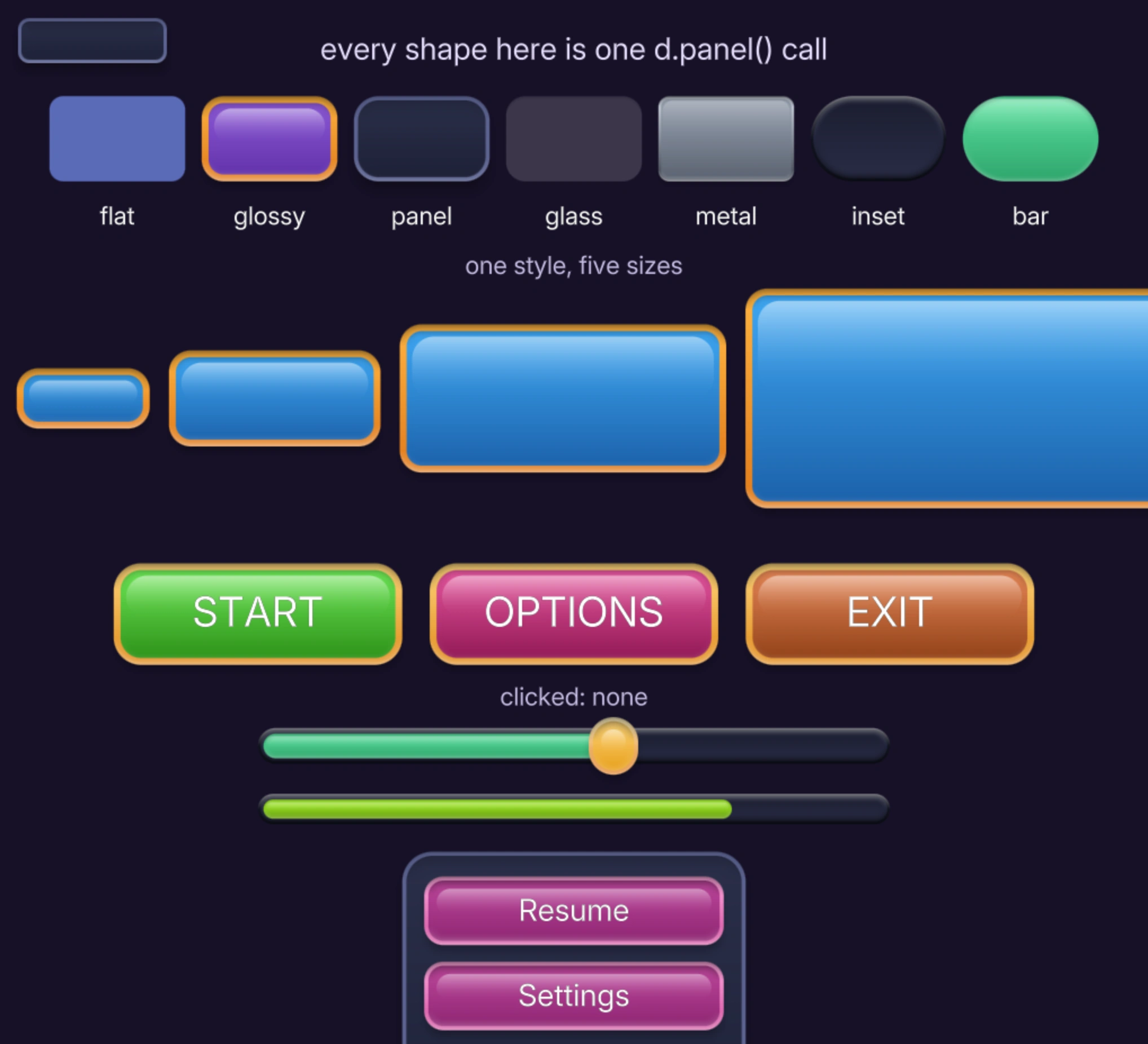
Every panel is drawn from maths. The rim, the bevel, the glossy highlight, the inner shadow and the drop shadow are calculated per pixel from the shape itself, at whatever size the panel happens to be. A small chip and a full-screen dialog get the same crisp edge, on any screen, at any zoom, because nothing is being stretched from a picture drawn at some other size.
There's no artwork to generate, nothing to download, and nothing that can come back subtly wrong.
Ask for a button, get a button

Thirteen controls ship, named after the ones everybody already knows: button, checkbox, radio, toggle, slider, progress bar, window, header, text input, text area, dropdown, scrolling list and label.
They behave the way you'd expect without anyone wiring them up. Buttons light up under the pointer and sink when pressed. Sliders keep tracking if your finger leaves the track. Fast taps register, including the awkward ones that begin and end between two frames. Windows size themselves to their contents, so the last row of buttons is never jammed against the bottom edge.
For anyone who does read code, a whole control is one line, and the game keeps the value:
volume = d.ui.slider(x, y, 240, volume);One line changes the whole look
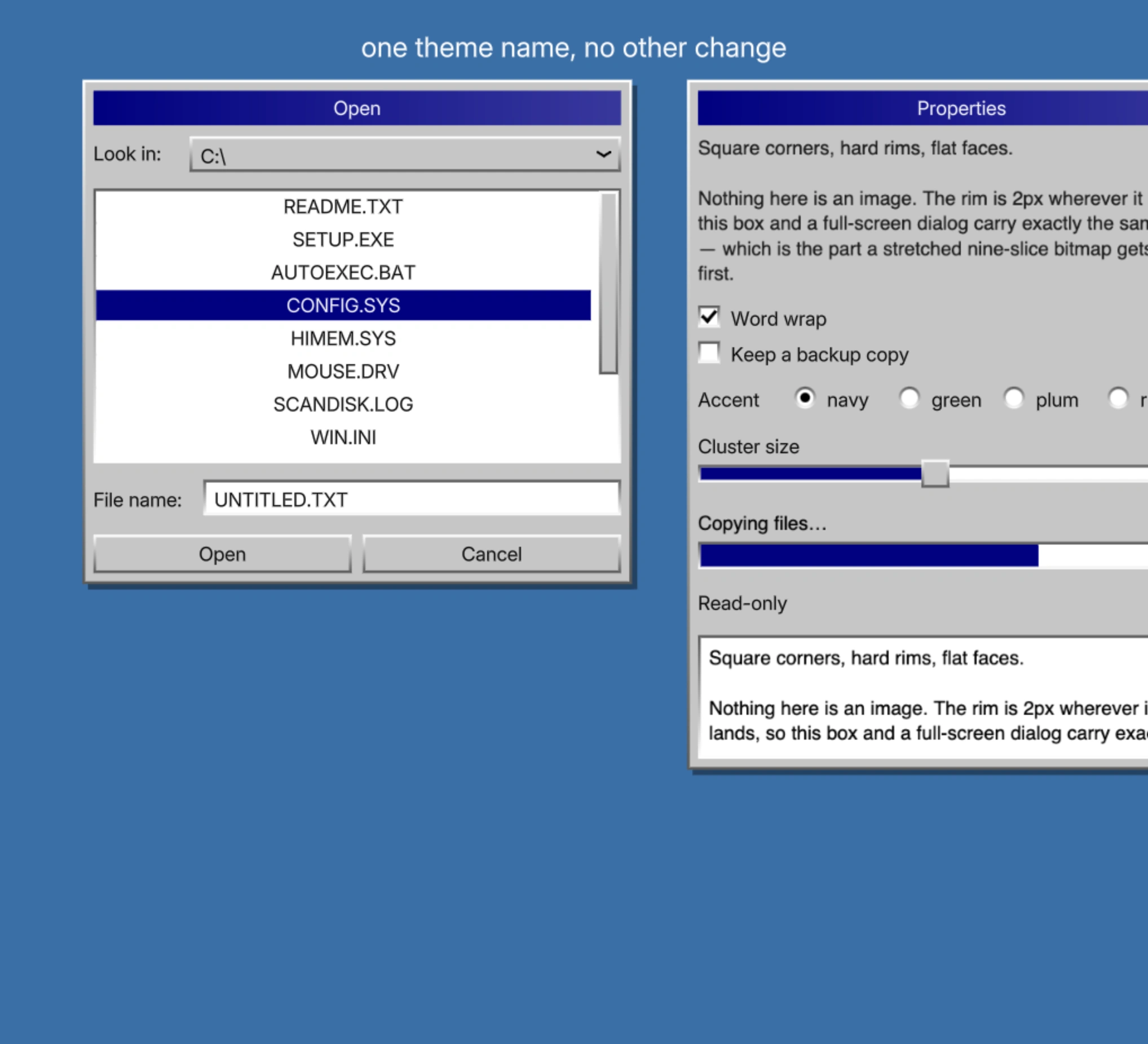
Three themes ship, each built from a single base colour you choose. Casual is bright and chunky, for arcade, puzzle and match-3. Compact is small and quiet, for strategy, sim and anything with a lot of controls on screen. Sharp is the 90s desktop: square corners, hard edges, flat faces, no curves anywhere.
Switching between them is one instruction, and every control on the screen changes together. "Make the menus look like an old computer" is a thing you can now ask for and get.
Scrolling, wrapping, masking
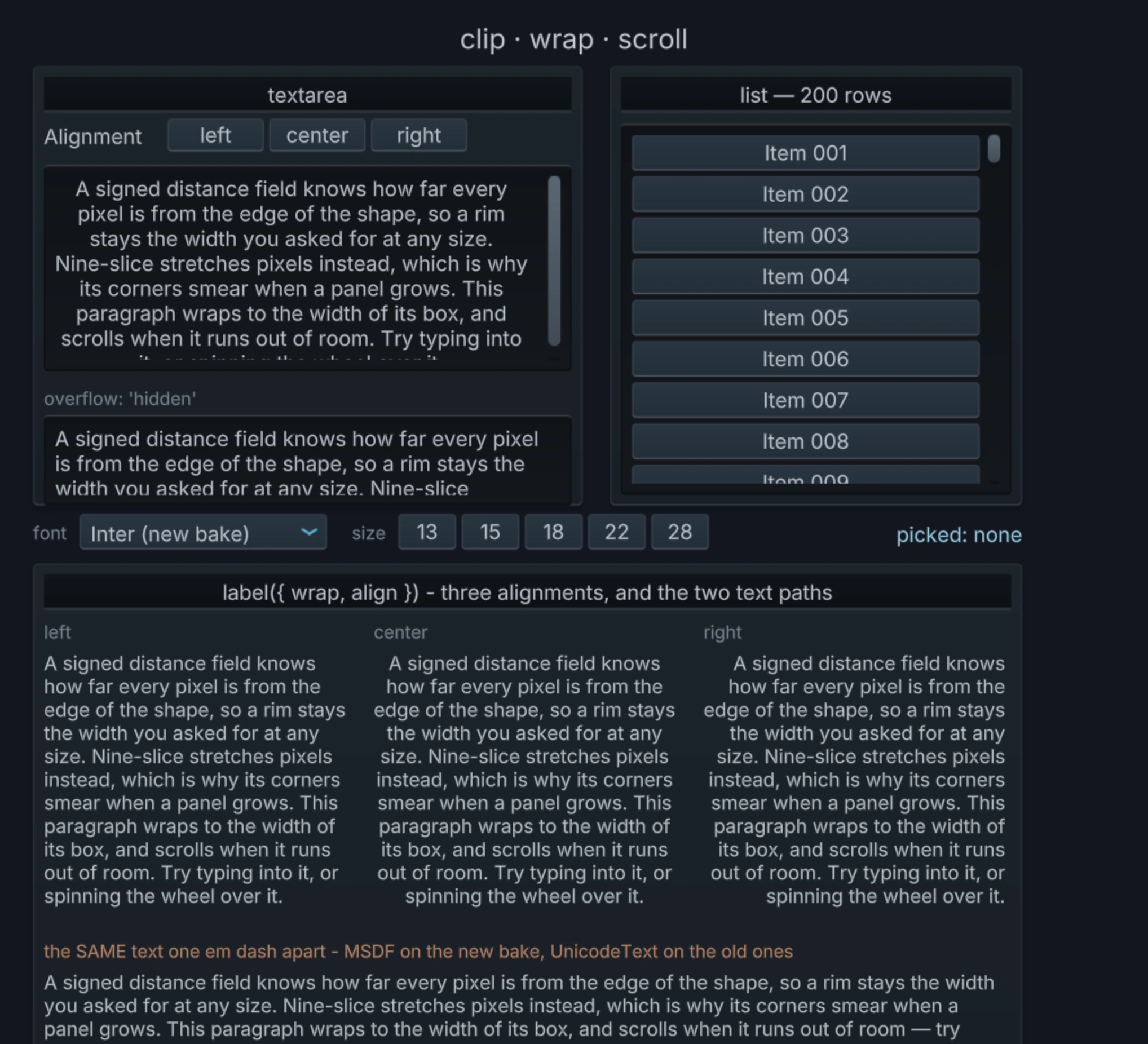
Long lists scroll and clip properly. Paragraphs wrap inside their box and stay inside it. Dropdowns open over whatever is beneath them instead of behind it. Drag the content and it follows your finger; drag the scrollbar and the thumb follows the pointer, the way each one behaves everywhere else.
The interface speaks every language too
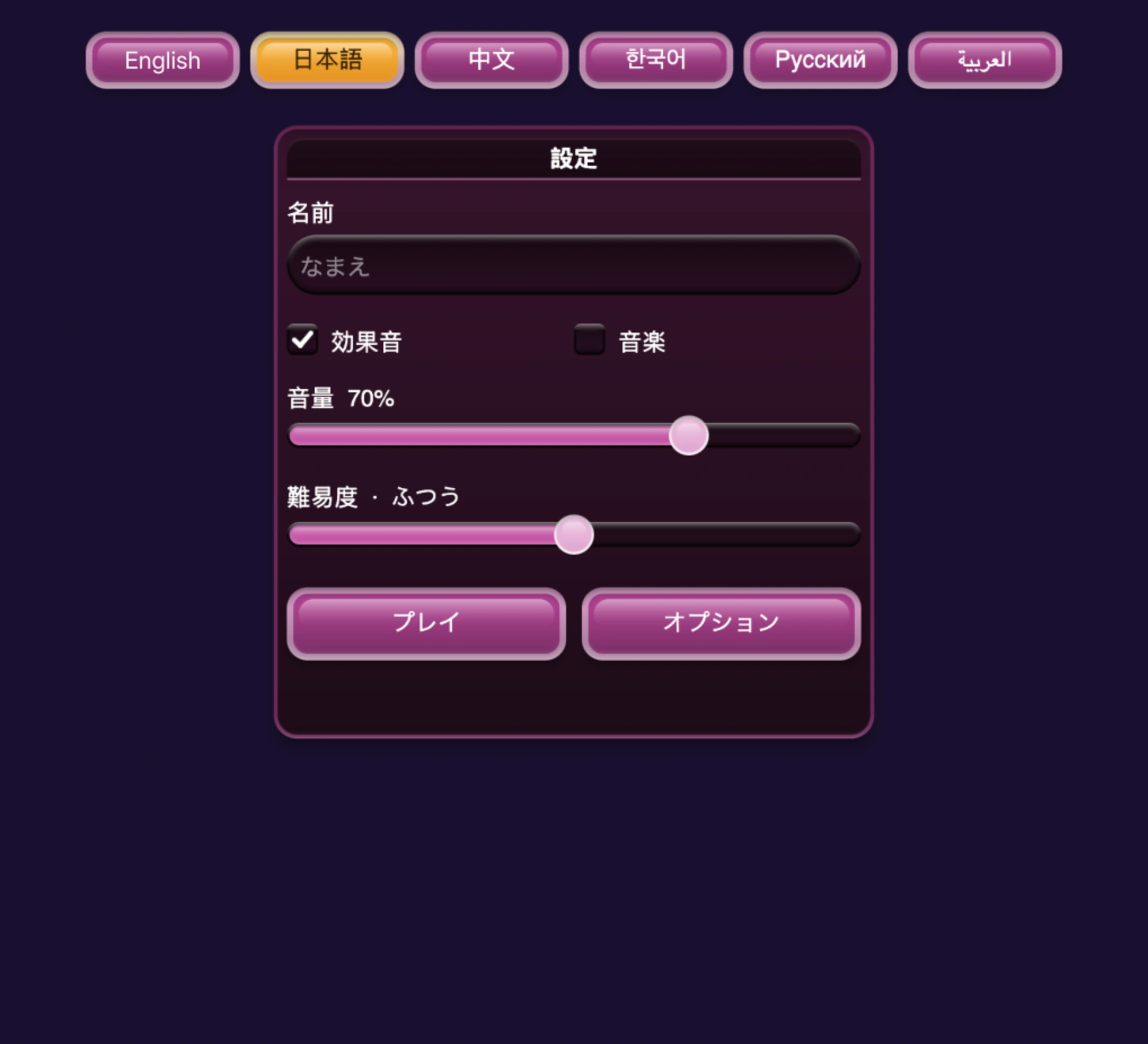
This is where the two halves meet. A button labelled 開始 works exactly like a button labelled Start, and the agent doesn't have to decide anything: each label picks its own rendering path based on what's in it.
One honest limit. The text in every control is correct in every script, but the arrangement of controls is still left to right, so a checkbox in an Arabic interface keeps its box on the left. Mirroring a full RTL layout is still a manual job.
24 fonts, ready to use
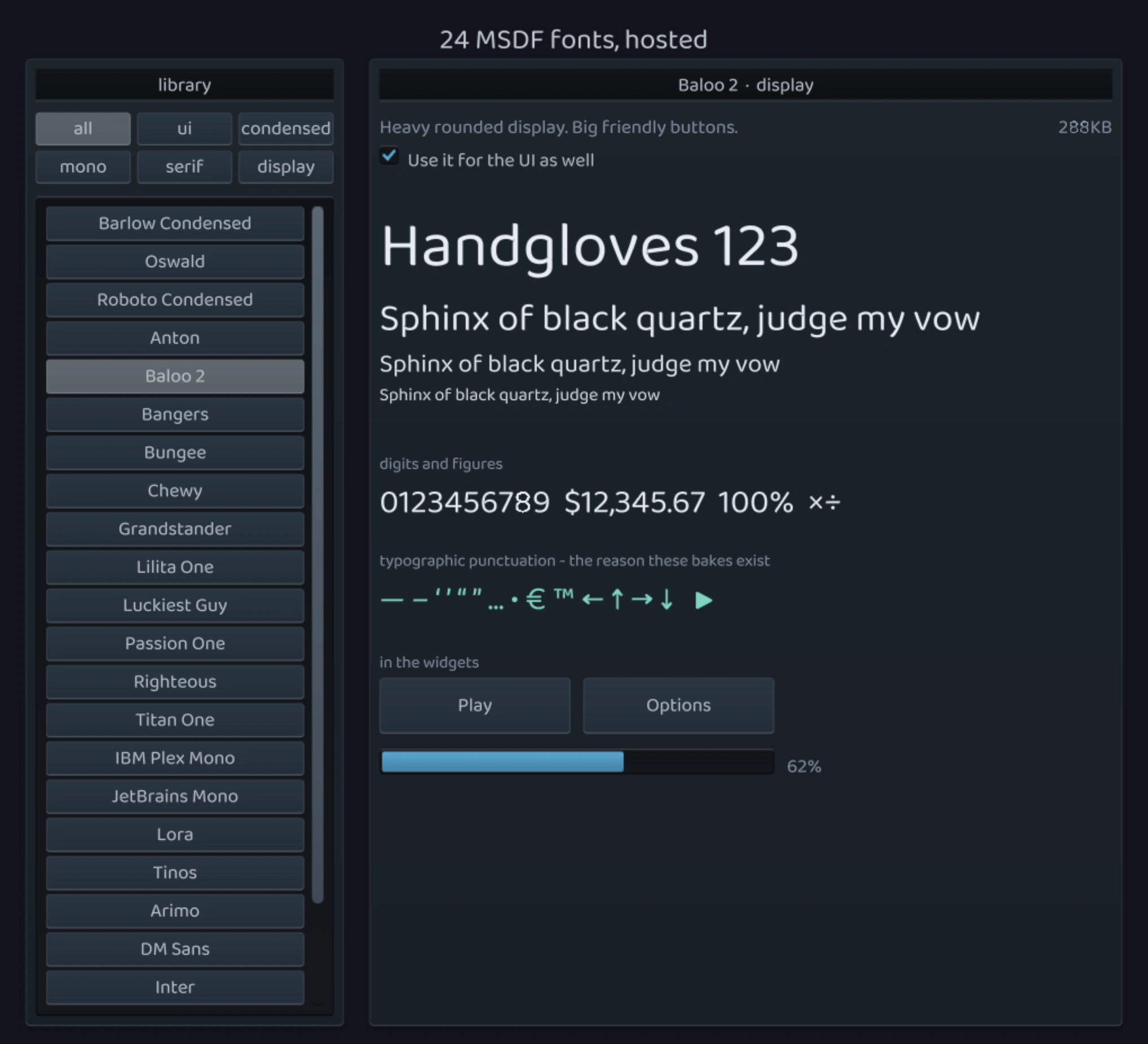
Neutral interface faces, condensed ones for dense HUDs, monospace for stats and timers, serifs for story text, and a shelf of loud display faces for titles. They're hosted, loaded by name, and nothing is bundled into the game, so asking for a comic-book font costs a download and not a build step.
They're also baked to stay sharp at any size, and to cover the punctuation real interface copy contains. Most font atlases stop short of characters like the em dash, and one of those in a paragraph is enough to soften the whole block, so these carry them.
What you can ask for now
"Make a match-3 game with the whole interface in Japanese: menus, score, and a dialogue box between levels."
"Build a word puzzle in Arabic. The menus should read right to left and the numbers should still read the normal way."
"A base-building game with a Windows 95 style interface."
"Add a settings screen with sound and music toggles, a volume slider, and a difficulty dropdown."
None of those needs an artist, a font file, or a translator to check the letters joined up. The agent already knows which text path each language needs and which control each request means.