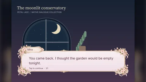

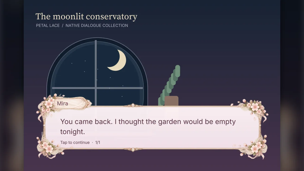
The pack
dialogue
function dialogue(options: DialogueOptions = {}): Pack<{ dialogue: DialogueApi }>Compose native dialogue: typography shapes text, UI draws panel materials.
Helpers
dialogueFrames
const dialogueFrames: { 'gilded-salon': IllustratedDialogueFrame; 'petal-lace': IllustratedDialogueFrame; 'satin-ribbon': IllustratedDialogueFrame; ... 9 more ...; coffeehouse: IllustratedDialogueFrame; } …Every frame protects the entire speaker plate and corner ornaments. Narrow vertical bands avoid stretching jewels and bows. Petal Lace's horizontal band sits to the right of its pearls, keeping those in the protected left cap. Width/height are the reading aperture, not the image's transparent outer bounds.
dialoguePresets
const dialoguePresets: { "petal-lace": DialogueTheme; "satin-ribbon": DialogueTheme; "midnight-rose": DialogueTheme; "gilded-salon": DialogueTheme; ... 19 more ...; 'novel-page': { ...; }; } …Twenty-four presets: thirteen illustrated CDN frames and eleven procedural compositions.
Types
DialogueAlign
type DialogueAlign = 'start' | 'center' | 'end' | 'justify'Logical alignment follows the paragraph's reading direction.
DialogueApi
interface DialogueApiNative dialogue service.
ready(presets?: readonly DialoguePreset[]): Promise<void>— Prepare selected presets, or the manifest selection if omitted — and, either way, the active UI theme's illustrated frame. Also awaited automatically by game.start().open(spec: DialogueSpec): DialogueSession— Create a scene-owned speech box after loading its font.loadSkin(source: DialogueSkinSource): Promise<DialogueSkin>— Load and cache illustrated frame pieces before open(); URL may point to a CDN.readonly presets: readonly DialoguePreset[]— Available preset identifiers, in gallery order.
DialogueFramePreset
type DialogueFramePreset = keyof typeof dialogueFramesIllustrated preset identifiers; image pixels are external runtime assets.
DialogueLabels
interface DialogueLabelsLocalised interface text.
reveal: string— Prompt while revealing.next: string— Prompt while waiting.finish: string— Prompt on the final page.
DialogueLine
interface DialogueLineOne speaker turn, automatically paginated to fit the view.
speaker?: string— Speaker label; omit for narration.text: string | readonly DialogueRun[]— Plain text or styled runs.language?: string— BCP-47 shaping language.direction?: 'auto' | 'ltr' | 'rtl'— Reading direction.speed?: number— Override clusters per second; zero reveals immediately.align?: DialogueAlign— Override paragraph alignment; start/end follow the reading direction.reveal?: DialogueReveal— Override the reveal presentation for this turn.fadeDuration?: number— Fade time in seconds, default .18.lineInterval?: number— Seconds between line starts in line-fade mode, default .7.
DialogueOptions
interface DialogueOptionsAssets selected by the game manifest; only these presets preload at startup.
presets?: readonly DialoguePreset[]— Presets to prepare from the CDN during game.start(). Procedural presets need no image.
DialogueOrnamentKit
interface DialogueOrnamentKitWhat an ornament hook is handed: the box, its theme, and ways to decorate it. Everything made through it sits above
the box's panel and is removed with the box.
readonly rect: { readonly x: number; readonly y: number; readonly width: number; readonly height: number }— The box, logical units.readonly theme: DialogueTheme— The resolved theme: panel, inks, accent, motif and size.readonly skin: DialogueSkin | null— An illustrated frame's art, when the box wears one; its ornaments are the art's own.panel(x: number, y: number, width: number, height: number, style: UiStyle, depth?: number): UiHandle— A UI panel (the SDF drawing the motifs use: fill, gradient, radius, border, bevel), atdepthasspriteplaces it.sprite(spec: { x: number; y: number; width: number; height: number; frame?: number | string; tint?: string; rot?: number; alpha?: number; depth?: number }): Handle— A sprite (an atlas frame by key or index, default the white square), turned byrotradians.depthplaces it among the box's own layers, 0 to 3 (default 2): the box's panel is at 1, ornaments at 2, an illustrated frame at 3 and the text above, so 0.5 tucks it under the panel's edge as the comic tail's outline does.
DialoguePreset
type DialoguePreset = keyof typeof dialoguePresetsPreset identifier accepted by dialogue.open().
DialogueReveal
type DialogueReveal = 'typewriter' | 'fade' | 'line-fade'Discrete clusters, overlapping cluster fades, or successive whole-line fades.
DialogueRun
interface DialogueRunA rich run; offsets are derived from concatenation, not authored by hand.
text: string— Literal Unicode content; no HTML is interpreted.font?: TypographyFonts— Real regular, bold, italic or fallback face.style?: TextStyle— Typography colour, size, decoration and shaping overrides.effect?: 'wave' | 'shake' | 'glow'— Animate complete shaped clusters.
DialogueSession
interface DialogueSessionA scene-owned dialogue view and controller.
readonly object: Handle— Root roster object; scene suspension freezes the controller.readonly line: number— Current zero-based speaker turn.readonly page: number— Current zero-based page within the turn.readonly pages: number— Page count for this turn.readonly revealed: boolean— Whether all clusters are visible and their opacity fades have completed.readonly closed: boolean— Whether disposed or finished.readonly missingGlyphs: number— Total missing glyphs in the current turn; inspect font coverage.readonly turns: number— Number of speaker turns, appended ones included.advance(): void— Reveal the page, then move to the next page on a subsequent call.setSpeed(clustersPerSecond: number): void— Change reveal speed; zero completes the current page.setReducedMotion(value: boolean): void— Toggle opacity fades and wave/shake/glow animations.dispose(): void— Close without firing onComplete. Idempotent.append(lines: readonly DialogueLine[]): number— Add speaker turns after the last one, for a conversation the game writes as it goes (a reply chosen from a menu, a log that keeps coming). Returns the new number of turns. Throws on a closed session or a line with an invalid speed, fade, interval, alignment or reveal mode. A session closes when its last page is dismissed, so append before then, or keep it open withautoDelayunset and append fromonPage.
DialogueSkin
interface DialogueSkinPrepared atlas artwork, owned by the game which loaded it.
readonly source: DialogueSkinSource— The source measurements the skin was prepared from.readonly texture: SliceTexture— The loaded slice texture that draws the border and panel.
DialogueSkinSource
interface DialogueSkinSourceSource-pixel measurements of original illustrated dialogue artwork.
url: string— Same-origin or CORS-enabled CDN PNG/WebP with alpha.width: number— Original image dimensions.height: number— Original image height in source pixels; the slices and boxes are measured against it.slices: readonly [number, number, number, number]— Protected left, top, right and bottom regions, in source pixels.mode?: 'nine' | 'horizontal'— Default nine; horizontal uses three pieces and scales caps with height.borderScale?: number— Fixed ornament scale for nine-slice skins; omit to derive it from aperture dimensions.textInset?: number— Horizontal text/reading-prompt inset in logical units; default 34. Reserve room for inward ornaments.aperture: SkinRect— Reading surface inside the illustrated border, in source pixels.speaker: SkinRect— Safe text bounds inside the illustrated speaker cartouche.
DialogueSpec
interface DialogueSpecNative speech-box configuration.
font?: TypographyFonts— Loaded face or stack shared by body, speaker and controls. Omit to use the active UI theme's dialogue font (or its label font).lines: readonly DialogueLine[]— Ordered speaker turns.preset?: DialoguePreset— Illustrated CDN or procedural preset. Omitted: the active UI theme's dialogue section when it has one, else petal-lace when it is loaded (and no custom skin is given), else the built-in minimal-cinema, which needs no artwork. A named illustrated preset must be ready.skin?: DialogueSkin— Prepared illustrated frame; replaces the geometric ornaments and nameplate.ornament?: (kit: DialogueOrnamentKit) => void— Decorate the box: called once as it opens, after the motif's own ornaments, with a kit to add panels and sprites that live and die with it (a crest, rivets, a seal, a vine down one side). Default none.motifOrnaments?: boolean— Draw the motif's own ornaments (its corners, lace, rails, ribbon). Default true; false leaves the box bare forornament.theme?: Partial<DialogueTheme>— Override preset design tokens.speed?: number— Clusters per second, default 32; zero is instant.align?: DialogueAlign— Paragraph alignment, default start (left in LTR, right in RTL).reveal?: DialogueReveal— Reveal presentation, default fade. Use typewriter for hard on/off letters.fadeDuration?: number— Fade time per cluster or line, seconds; default .18.lineInterval?: number— Seconds between line starts in line-fade mode; default .7.reducedMotion?: boolean— Disable opacity fades and animated effects without changing reveal speed.autoDelay?: number— Automatic advance delay after a page finishes, seconds; omit for manual.interactive?: boolean— Enable pointer and keyboard handling. Default true.rect?: { x: number; y: number; width: number; height: number }— Logical box coordinates; omit for the preset layout.labels?: Partial<DialogueLabels>— Localised prompts; default English.onComplete?: () => void— Called after the final page is dismissed.onLine?: (line: number, turn: DialogueLine) => void— Called when a speaker turn starts showing, the first one included, with its zero-based index and the line: the moment to swap a portrait, play a voice clip or mark a story flag. Called once per turn.onPage?: (line: number, page: number, pages: number) => void— Called when a page starts revealing, the first one included: the zero-based turn and page, and the turn's page count.
DialogueTheme
interface DialogueThemeDistinct native panel compositions; override individual tokens in open().
name: string— Display title.panel: UiStyle— Native SDF material.ink: string— Text colour.accent: string— Accent and nameplate colour.nameInk: string— Nameplate ink.motif: 'lace' | 'ribbon' | 'rose' | 'gold' | 'paper' | 'arcane' | 'school' | 'noir' | 'cinema' | 'prism' | 'holo' | 'terminal' | 'pixel' | 'ledger' | 'wood' | 'comic' | 'phone' | 'novel'— Composition and ornaments.size: number— Text size in logical units.
IllustratedDialogueFrame
interface IllustratedDialogueFrameAuthored source-pixel bounds. Artwork is fetched from the public Spaces CDN at runtime; no image bytes are bundled.
name: string— Display title of the frame, such as 'Gilded Salon'.preset: NativeDialoguePreset— The native preset whose layout and motif the frame is drawn with.source: DialogueSkinSource— Source-pixel measurements and artwork URL for the frame image.theme: Partial<DialogueTheme>— Theme fields that override the preset's: ink, name ink and panel colours chosen to suit the artwork.